1992 Duke alternate colors
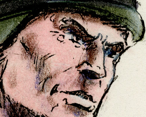
Here’s Kurt Groen’s presentation art (marker over photocopy, not paint) for 1992 Duke in green, brown, and black, as opposed to the beige and red that made it to market.
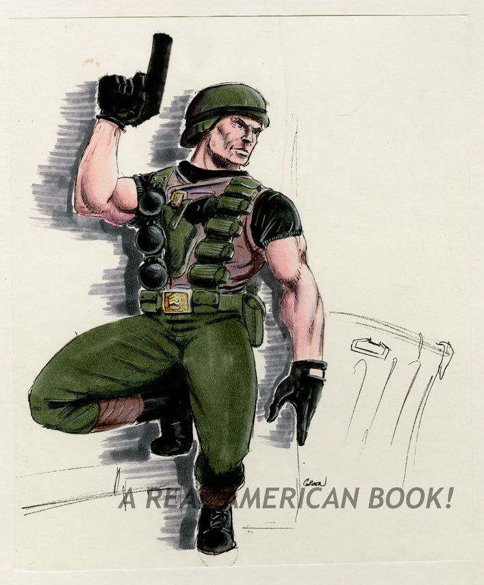
What other colors might that trash can have been?

Here’s Kurt Groen’s presentation art (marker over photocopy, not paint) for 1992 Duke in green, brown, and black, as opposed to the beige and red that made it to market.
What other colors might that trash can have been?

I kind of like this version better. It harkens back to the Original Thirteen, fits in nicely with them, and would have made for a great homage/update figure given that 1992 was the line’s tenth anniversary.
Why didn’t they go with this? WHY???
Maybe because of Desert Storm. Maybe Marketing was seeing more color in competitive lines.
Excellent! Nicely reminiscent of the 2000 update: http://www.yojoe.com/action/00/duke8.shtml
I wonder if that update was inspired by this?
Thanks, Justin. Yeah, as you must have been writing this I remembered the 2000 version and edited the post.
Very cool. I always wished he was released in the tan colors but with brown instead of the read. This looks cool also.